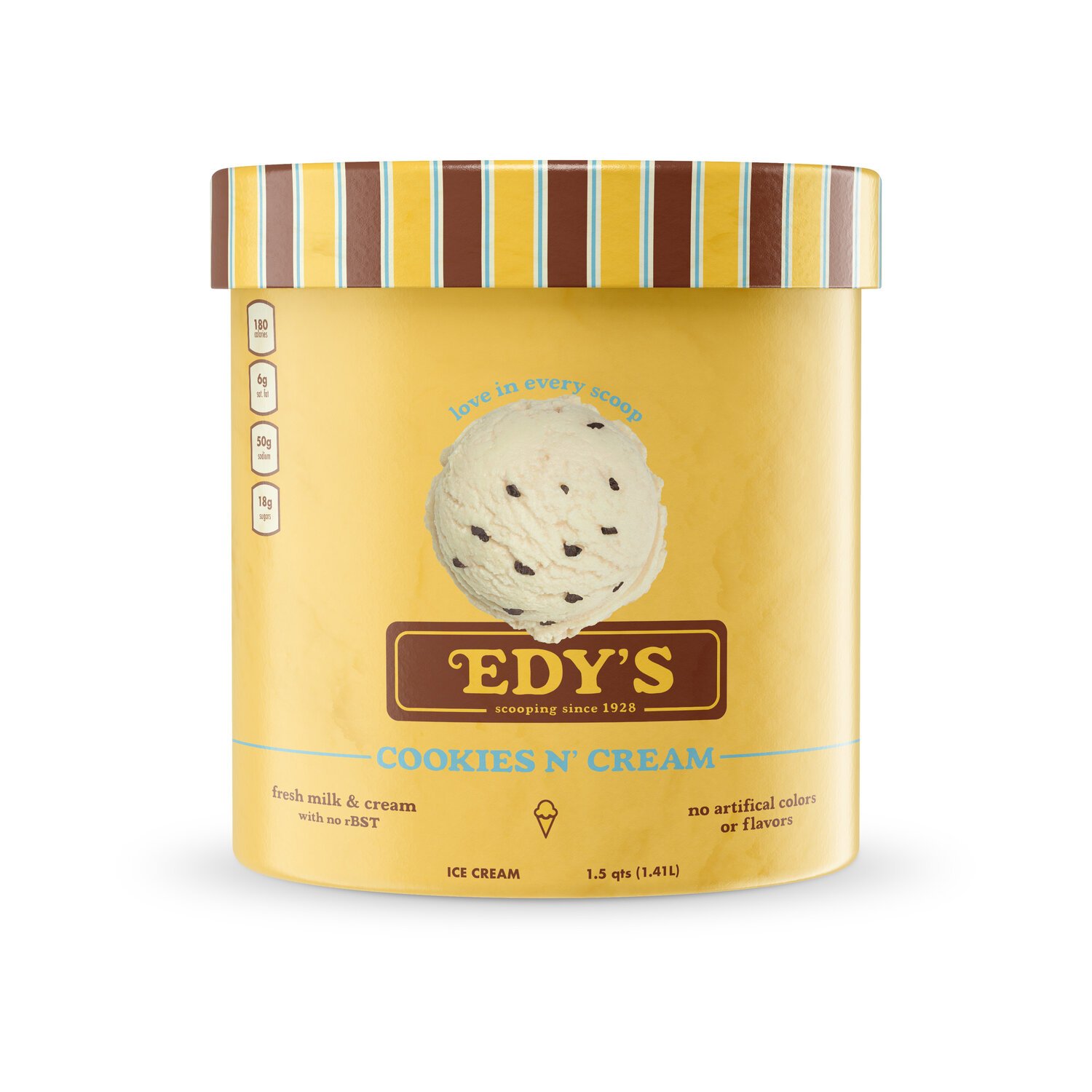
Edy’s Packaging Design
Revamping Edy's Ice Cream's look and feel aimed to blend its rich heritage with a more modern touch. With a deep family history, the goal was to make the brand resonate with today's consumers. The redesign mixes nostalgia with fresh elements like updated fonts, colors, and graphics while keeping the brand's authenticity. The evolved logo and revamped packaging tell Edy's story, highlighting its dedication to quality and family enjoyment. This strategic update positions Edy's Ice Cream as a brand that respects its roots but stays in tune with what today's consumers are looking for, ensuring it stays relevant in the competitive market.
before and after comparison
before and after comparison


